
Scroll
Kōzan Tea House
Kōzan Tea House is a local boba and tea shop located in the Inland Empire, serving Ontario and surrounding cities.
Services: Strategy, Design
The Challenge
In the current day, boba and tea shops are now beginning to separate themselves visually from their competitors by becoming more design-focused in their branding, product, and packaging design. Kōzan Tea House out of Ontario, CA followed suit and hired us to complete a branding suite that holds a candle to some of Southern California’s best looking boba shops and tea houses.
The Process
Kōzan originally approached us without a name. During the Identify phase, we established that customization was a critical factor to their target audience. Unlike most other boba and tea shops, they wanted to give their customers the ability to craft their concoctions and make a tea drink completely customized to them, with unlimited possibilities.
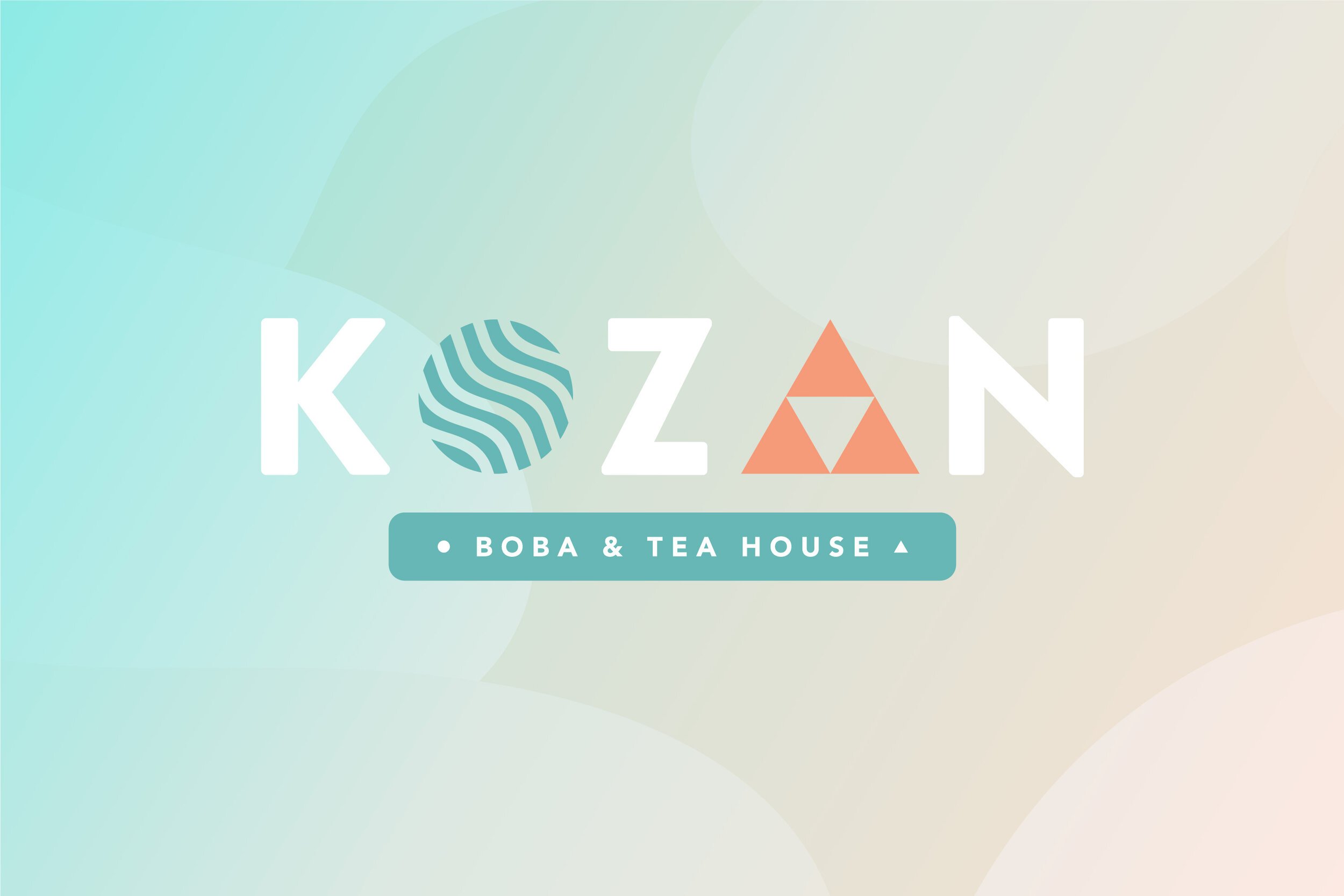
After brainstorming more than 120 possible name concepts and conducting multiple focus groups and surveys, we chose Kōzan because of its meaning and relevance to what we learned in the Identify phase. In Japanese, Kōzan translates to “my/mine.”
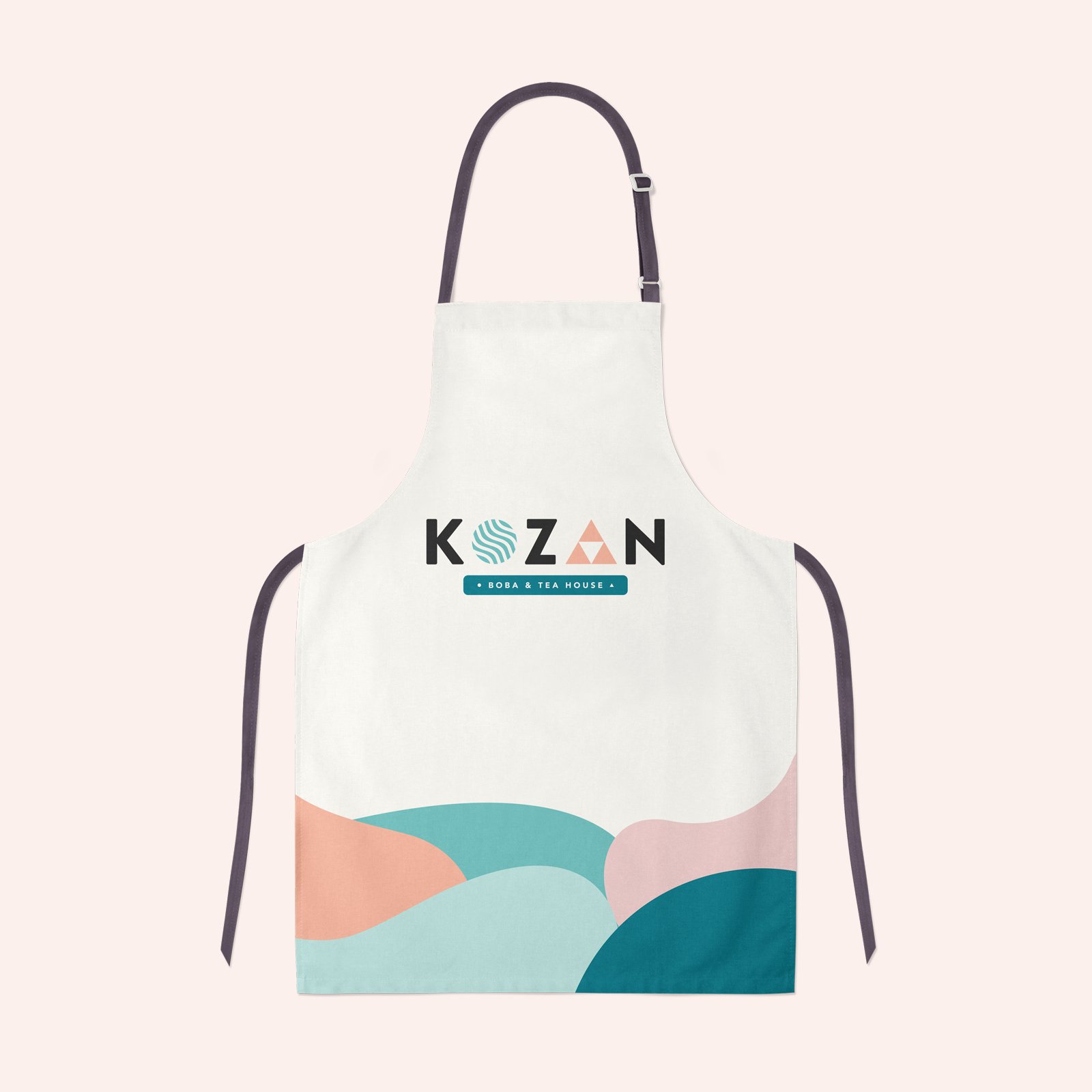
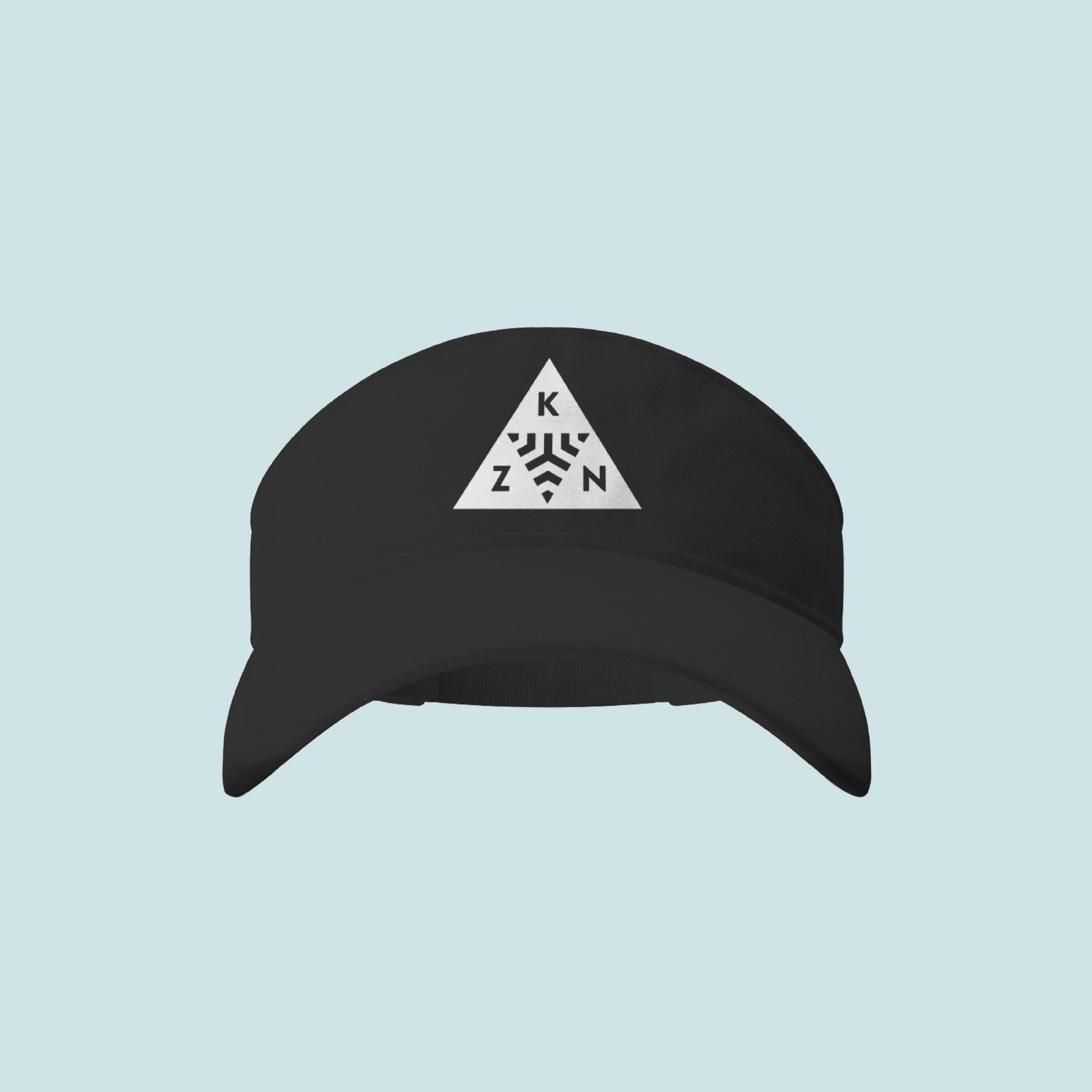
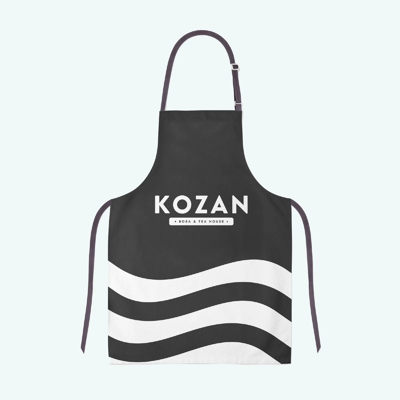
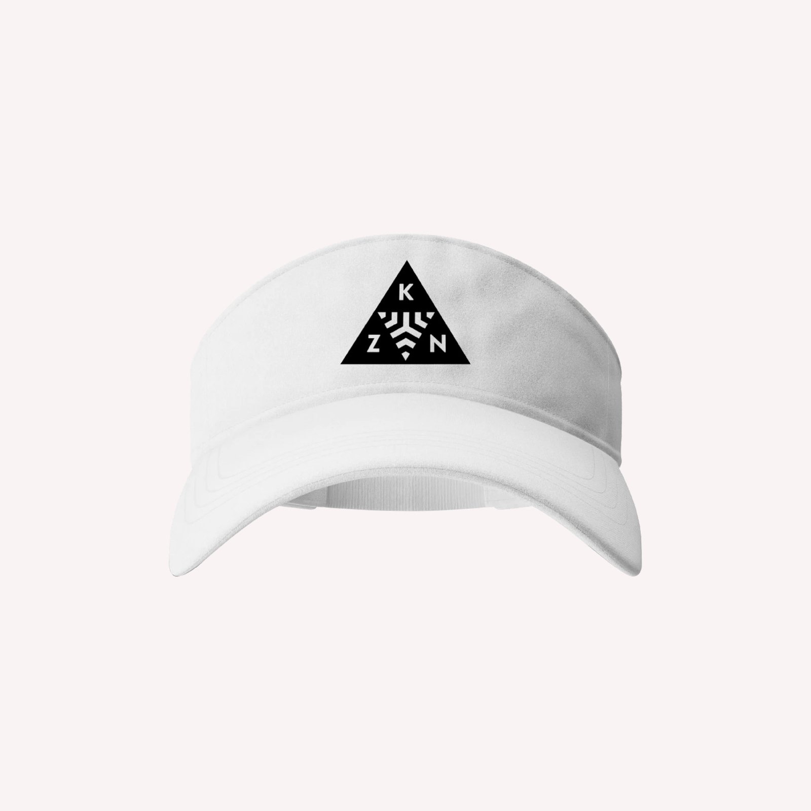
Selecting this name inherently helps emphasize the diverse options and customizations that the store would ultimately offer to its customers. From there, the goal was to create a word mark that was bold yet minimal, easily readable, all with a hint of fun. Basic geometric shapes integrate into the word mark to accomplish this in a simple, straightforward way.
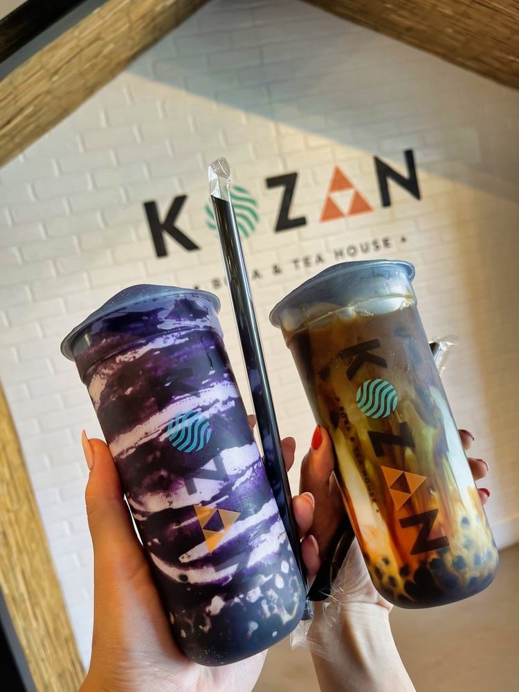
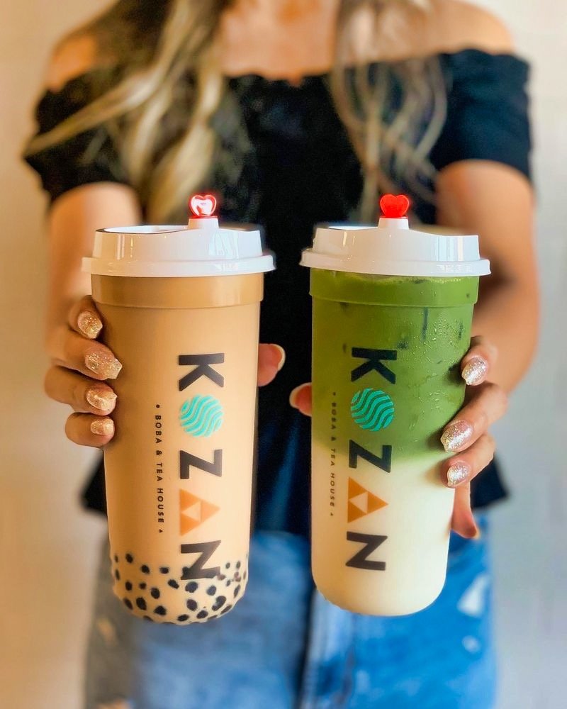
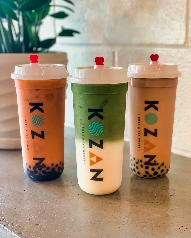
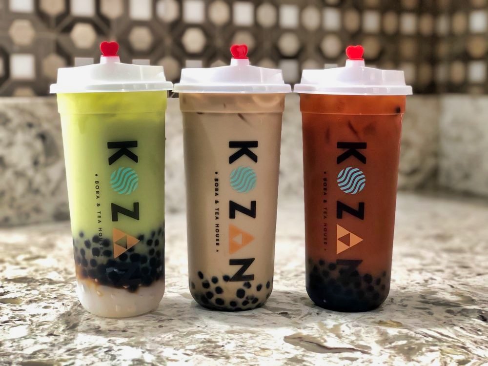
Kōzan’s branding would ultimately need to be visible in areas as big as signage, and as small as 16 oz plastic cups. Brandon Grotesque, a typeface with numerous weight choices, helps the word mark stand out in different applications. Moreover, the rounded edges of its letters are soft on the eyes, and don’t allow the logo to take itself too seriously.
The color palette creates a fun, easy going, light, airy feeling — all while resembling shades of tea and tea leaves.
The Results
The brand designs translate easily to print, apparel, and store gear/uniforms.

“The branding is on point. Incorporating colors really made it come out better than I could’ve ever expected!”
— Christine Chiu, Owner • Kōzan Tea House
Yelp Page
A few photographs of the branding in action, from Kōzan’s Yelp page.
Complete list of services: Research (Consumers, Archetypes), Insight & Planning, Naming, Logo, Illustration, Identity (Color, Typography, Elements)